Start your Venue Chart with Seatmap Pro – Step-by-Step Guide
Build a professional seating chart for your venue in under an hour. This step-by-step guide covers editor setup, seat numbering, pricing zones, and ticketing integration.
When it comes to integrating a swift and flexible ticketing system for a large venue, the biggest problem out of them is to correctly implement it to mobile
When it comes to integrating a swift and flexible ticketing system for a large venue, the biggest problem out of them is to correctly implement it to mobile phones. Nearly 60% of all online traffic that comes to your website is coming directly from the mobile phones or mobile apps. And handling the right Therefore, we highlighted the most obvious and most common mistakes found in the seating chart platforms or apps.
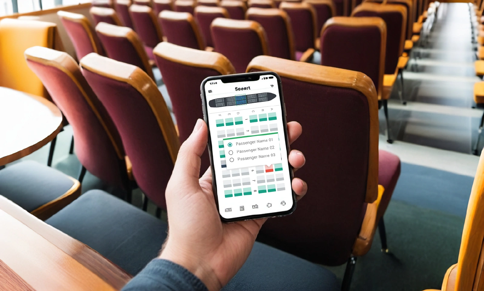
One of the most obvious and noticeable issues encountered in practically any website or application is the control panel for the seating chart. One of the most core things that any vendor should focus on is how easy it is to select and book the specific seats inside a limited space on a mobile phone.
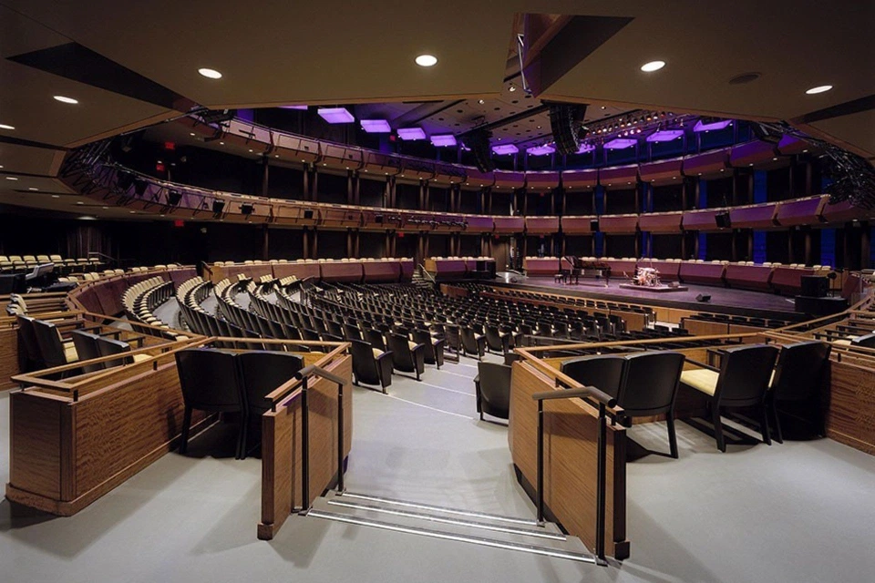
Since most of the developers come up with a bunch of the instruments/labels that are displayed on the desktop version. Imagine, if you have an event that is a grand one, like a theater opera. Each one of the seats might have a small label with a seat row and seat number. This might be perfectly fine for a large desktop computer screen, but on a mobile phone, it can be a nightmare to navigate and select the correct seat.
So instead of cramming labels for every seat, consider implementing a zoom function with a clear distinction between seat rows and seat numbers. Or you can simply put the labels inside the seats themselves in order to save the screen space. Highlighting or outlining the selected seat is also crucial for better user experience.
Just as the title says: every single element of your website version must be relatively placed inside the mobile phone. The same applies for iFrames or APIs that you want to integrate inside the mobile app or mobile phone view.
Just to summarize: shrinking down a desktop view for mobile is a recipe for disaster. Tiny text, buttons too close together, and an overall cluttered layout will make it nearly impossible for users to navigate and select seats. Instead you must design your seating chart with a mobile-first mentality. Focus on clean layouts, clear visual hierarchies, and responsive design elements that adapt to different screen sizes.
And if we are talking about large venues that often have a large number of seats there comes another common responsiveness issue: the scrolling. It definitely can create a frustrating user experience. So we highly recommend implementing features like section jumps (e.g., Orchestra, Balcony) or interactive venue maps to allow users to quickly navigate to their desired seating area.
Another common, yet technically foreseen issue that can be easily avoided, which is failing to prepare your mobile app for high traffic situations. Large events (like NFL) can cause a surge in users attempting to purchase tickets simultaneously, leading to crashes, slow loading times, and a total chaos on your web app.
By implementing a robust server infrastructure that can handle peak loads during high-demand events, you can easily avoid this issue. Consider cloud-based solutions that can scale automatically to meet user traffic. Regularly test your app’s performance under simulated high-traffic scenarios to identify and address any potential bottlenecks.
While zooming in and out can be a helpful tool for navigating large seating charts, improper implementation can lead to a frustrating user experience. Here are some common zoom struggles:
We advise you to test and refine your zoom functionality to ensure it is smooth, responsive, and offers a clear view of the seating chart at all zoom levels.
A seamless user experience requires a smooth flow of information between the seating chart and other crucial functionalities. Here’s why poor integration can be a major turn-off:
Ensure seamless integration between the seating chart platform, ticketing system, and any relevant event information databases. Real-time data updates and clear display of event details within the app will create a more cohesive and user-friendly experience.
We really hope that the mistakes we highlighted will bring you the knowledge necessary to create a mobile-friendly seating chart platform that offers a smooth and efficient user experience.
Want to avoid all of these common issues and launch the platform without a hassle? Try Seatmap Pro, an on-premise ticketing solution with focus on an improved Time-To-Market and user conversion. Try it out for free and see how flexible our solution can be for your venue.
Build a professional seating chart for your venue in under an hour. This step-by-step guide covers editor setup, seat numbering, pricing zones, and ticketing integration.
Long story short, we have created our landing page before COVID-19.
After a long and tedious period of recovering from COVID-19 pandemic, ticketing industry is back on track and so is Seatmap.pro. We mark this event with special offers for our new clients.